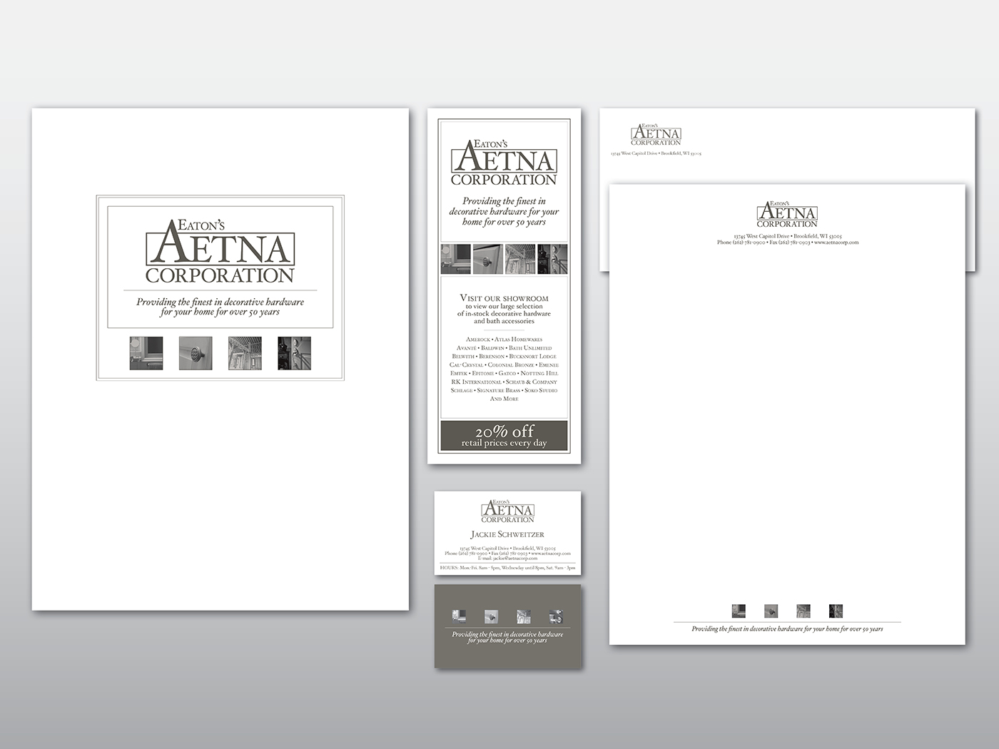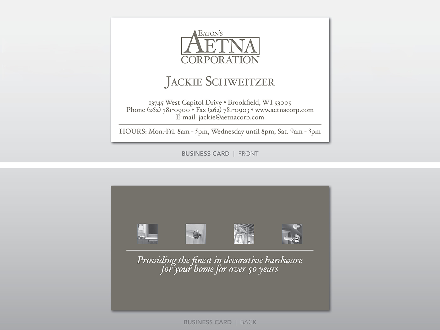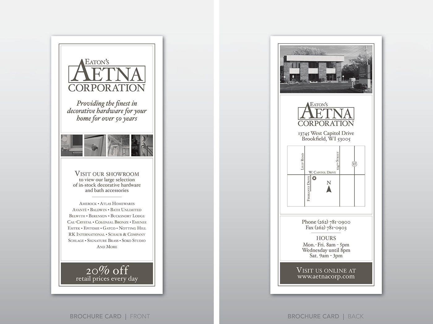
ABOUT THE PROJECT
After being in business for over 50 years, Aetna Corporation needed their logo and corporate identity revamped. As a well established hardware retailer to some of the largest home builders in the state, they didn’t want to stray from their old logo and lose their identity altogether. As a result, we kept the shape of the logo similar to the original, but changed the font to a more sophisticated style, giving the company a richer feel and customers a greater feeling of confidence. A clean, bold gray/beige color was chosen and was the sole color used in an effort to keep printing costs low. Per the client’s request, four (supplied) product photos were included as graphics in all of the pieces, allowing for greater continuity between each piece. This same graphic treatment was carried further into trade show advertising materials where potential customers would not only receive the materials at the show itself, but would also receive them by mailings following the show. This kept the company fresh in customers’ minds and encouraged them to visit the company’s showroom in the future.